Tag Archives: CMYK

The Evil EPS

5 Feb

Now why do we call the EPS file format, more formally referred to as encapsulated postscript, evil? Because, with EPS, we are never quite sure what we are going to get. The format has less than consistent support for transparency advanced clipping masks and spot color. In addition, certain export settings resemble to the old style “flattened” version of digital art, such as the PDFX1/a.

Let’s take a look at how wacky this can get by revisiting our sample art from a previous posting. Notice that the same spot color is used on several different objects. Also, take note of the white portion of the BPI logo; it employs a feature called a drop shadow which overlays the custom Reflex Blue spot color.

Now, let’s make an EPS from Adobe Illustrator with the export compatibility set for CS3. First, let’s take a look at our initial result (Banner_Art_eps).

Banner_Art_eps

Notice that the layer structure is intact. It is unchanged from the Illustrator source file. Now, let’s examine the art in outline view (see Banner_Art_eps_Outlines).

Banner Art_Outlines

Notice the complete absence of slices. As you can see in the Banner_Art_eps_LiveScripts screenshot below, the Illustrator scripts for fills and drop shadows are still active. A number of newer RIPs (Raster Image Processors) can read these appearance scripts and correctly interpret them.

Banner_Art_eps_LiveScripts

So where’s the problem? Let’s toss a bomb into the mix. Let’s place the same art in InDesign and export to EPS and use the highest quality settings available (see InDesign_Export_eps screenshot).

InDesign_Export_eps

Let’s take a look at the results in outline view (see InDesign_eps_Outlines).

InDesign_eps_Outlines

Instead of a digital file made up of vector objects and live scripts, we now have a mixed bag of vector and raster objects. We also have a pretty obvious slicing error. But wait, it gets worse! Take a look at the color values in the logo (see Color_Error1 screenshot below).

Color_Error1

That’s not the only potential color problem. Take a look at the cmyk values of the image slice in the logo (see Color_Error2 at left). That particular slice butts up to the vector object with the Color_Error_2original spot color value (see Color_Error3). Now things are getting really complicated. In the large format world, a RIPColor_Error_3 
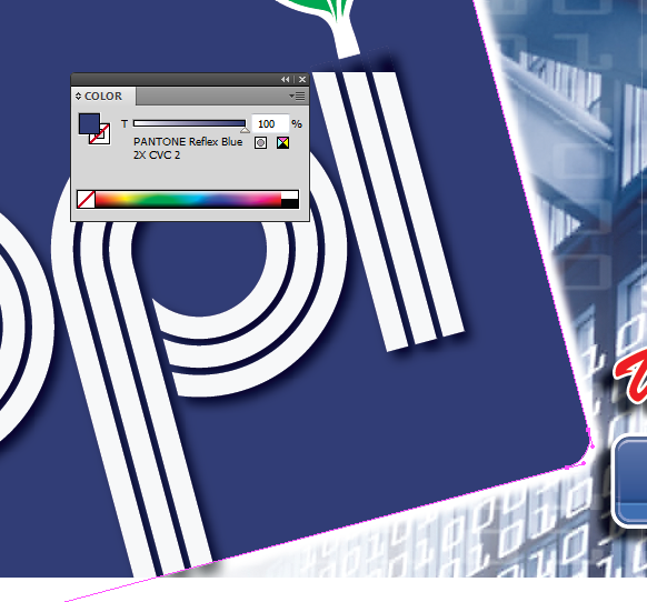
calculates color values and it usually calculates a spot color, vector object in LAB. However, a raster image, like the one in Color_Error3, will be calculated in cmyk. Print this file and you will have two very different shades of blue piled next to each other. Furthermore, print this file and you better be ready to do this job over.

Frankly, the future of the EPS file format is solidly in the past. EPS is rapidly becoming an outdated file format which is being replaced by PDF just like PostScript itself is also being phased out and replaced by PDF. Check out what Dov Isaacs from Adobe said in a discussion on a Print Planet forum about the future of PostScript:

“ …Adobe will continue to support EPS as a legacy graphics format for import of non-color managed, opaque graphical data into Adobe applications (such as InDesign and Illustrator). Although we certainly do not recommend that new graphical content be stored in EPS format (except to satisfy the need to import data into page layout programs that aren’t quite PDF-centric), our user base should feel comfortable that there is no need to worry about a need to convert their very sizable libraries of EPS-based graphic assets.”

When a principal scientist with Adobe employs the phrase “legacy graphics format,” it’s time to move on.

Flattening and transparency are pretty confusing subjects. If you’re still curious, or just plain lost in the woods over flattening and transparency, check out the online tutorial below for more information.

http://vector.tutsplus.com/articles/help-with-selling-vector-stock-in-eps10-format

Constructing a Bullet-Proof Digital File with InDesign

9 Oct

The InDesign workspace is a bit trickier to manage for consistent color than Illustrator. Unlike Illustrator, InDesign was created for the purpose of managing large multi-page documents such as magazines, newsletters, and books. As a digital layout program, it is obviously not limited to multi-page design. Several graphic designers use InDesign for business cards, brochures, posters, large format display, and web content.

When creating a new document, you should pick the color settings that best match the method of reproduction. For offset printing, pick CMYK; for photographic reproduction (Durst, LightJet, and Lambda) or web/internet, pick RGB. To access or change the color settings for your document, go to the top of the window in InDesign and select Edit > Transparency Blend Space. Then pick Document RGB or Document CMYK.

Next, set the appropriate Transparency Flattener Preset (Edit > Transparency Flattener Presets…). There are only three options: low, medium, and high resolution. (See TF_Presets screenshot.) The low preset is intended for web and silkscreen printing, medium is intended for large format reproduction, and high is intended for high quality offset printing.

Finally, check the Color Settings of your document (Edit > Color Settings). (See Color Settings screenshot.) Most of the work BPI receives is designed for offset printing, so we use the default North America Prepress 2 settings. Notice the field CMYK: Preserve Numbers (Ignore Linked Profiles) setting in the Color Management Profiles field. By employing this setting, InDesign is prevented from performing a color transformation on art opened on this workstation or pasted into this document. Otherwise, art that has a different CMYK profile would have the CMYK values shifted to fit within the ICC model for US Web Coated (SWOP) 2. If you’re new to this blog, just trust us–an uncontrolled color transformation is a bad gamble.

Note the check boxes underneath Color Management Policies. When InDesign detects a missing or mismatched ICC profile, the Profile or Policy Mismatch dialog box will open. By default, the “Leave the document as is” option is selected. This is the option BPI recommends. Remember, unmanaged color transformation = bad gambling.

Now, let’s take a minute to review some of the tips from previous blog posts for successful color management:

  1. Complete all your image work first.
  2. Make sure all of your images are in the appropriate color family for your end product (RGB for web and photo or CMYK for offset printing and large format work reproduction).
  3. All images should be in the same profile. (Examples are: sRGB IEC1966-2.1 for web; Adobe RGB 1998 for photo and Durst/Lambda or LightJet; US Web Coated (SWOP) v2 or Coated Gracol 2006 for most North American offset printing; etc…)
  4. Conserve your assets! Make sure you still have (or have access to) unaltered client originals and your multi-layer Photoshop files.

Before you construct your art, you should consider a couple of additional warnings. First, objects with transperancy effects interact with each other. Be sure you’re fully aware of the capabilities of your service provider before you stack drop shadows, glows or other effects on top of each other. Of course, if you’re using BPI, you don’t have to worry about that. Second, when designing for offset printing, avoid overlaying transparent effects or objects on top of spot colors. Technically, a spot color is supposed to print separate from the normal 4 colors. When RIPS attempt to create a flattened file for color seperation, they create image-blocks (sometimes called slices) of raster objects which will vary in color value and appearance from the objects that have a solid spot color value.

Finally, let’s talk about some of the export options for PDF in InDesign. When you elect to export as PDF, the first thing you get is the Export Adobe PDF dialog box. (See Export PDF screenshot.) BPI generally recommends the High Quality Print preset as a starting point. For enhanced transparency support, we suggest a using a compatibility setting of Acrobat 6. (See Export PDF Modified screenshot.) Also, we suggest employing ZIP compression (see Export Compression screenshot), setting the Output Color options to “No Color Conversion,” and setting the Profile Inclusion Poilicy to Include Tagged Source Profiles. Remember, if all your image work has been converted to the appropriate color space and ICC profile, you don’t need InDesign to perform color conversion. We recommend ZIP compression to avoid piling jpeg compression on top of jpeg compression, which can result in an unattractive image appearance. Also, including the tagged source profiles lets your print provider know what image environment the art is intended for and doesn’t change the color values of your file at all.

PS: Perhaps some of this seems a bit confusing. If you’ve never visited this blog before, visit some of our previous postings: “Why What you See Is Not Always What You Get!,” “Basketballs, Meatloafs and Frisbees, Oh My!,” and “Those Pesky Profiles.”

Constructing a Bullet-Proof Digital File with Illustrator

17 Jul

Making your art work varies from platform to platform.  Although there are commonalities (we’ll review them in a little bit), workflow practices vary depending on the application. In order to keep the size of this entry small enough to keep us out of trouble with our blog-meister, let’s limit this discussion to Adobe Illustrator.  Illustrator is the vehicle of choice for most large format service providers in the creation of print files.

Let’s take a minute to review some of the tips from previous blog posts for successful color management:

  1. Complete all your image work first.
  2. Make sure all of your images are in the appropriate color family for your end product (RGB for web and photo or CMYK for offset printing and large format work reproduction).
  3. All images should be in the same profile.  Examples are: sRGB IEC1966-2.1 for web; Adobe RGB 1998 for photo and Durst/Lambda or LightJet; US Web Coated (SWOP) v2 or Coated Gracol 2006 for most North American offset printing.
  4. Conserve your assets! Make sure you still have unaltered client originals and your multi-layer Photoshop files.

Now, let’s create our working file in Illustrator. The first thing is to check your document color space (File > Document Color Mode > CMYK). Why is CMYK recommended if you’re working in RGB? As we talked about in a previous blog-posting, conversion of postscript values in vector art from CMYK to RGB is a reliable method for maintaining a similar appearance across the spectrum of web and print. It is not reliable in the other direction. (screenshots below in this order: first, CMYK_Black; second, Change2_RGB_Black; and finally, ChangeBack2CMYK).

We will now assign the ICC profile. What we’re going to do is set up Illustrator in such a way as to prevent unintended color transformations (as demonstrated in the previous screenshots). Go to the top menu bar and select Edit > Assign Profile. This will open the Assign Profile dialog box. Check the top radial button, “Don’t Color Manage This Document.” This will prevent Illustrator from changing the color values of any files you link to (“Place” in the File Drop Down Menu) or paste into your document. If you leave Illustrator color management in its default profile (for CMYK that’s generally in US SWOPv2 in North America), each time you paste art from other files into your working file you may, depending on your version of Illustrator, experience unwanted color transformations when you paste or place and embed art into your working file.

Finally, let’s set the value for the Tranperancy Preset. The Transperancy Preset (sometimes referred to as the “flattener preset”) controls the pixel values for any raster objects Illustrator creates from effects like drop shadows, outer glows, and blurs. You want to go to the “Preset:” drop down menu inside the Transparency section of the Document Setup dialog box (File > Document Setup or Alt/Opt+Com/Ctrl+P). You have four options: High Resolution, Medium Resolution, Low Resolution, and Custom. High Resolution assigns pixel values of 300 and is considered the standard for offset printing. Medium Resolution assigns pixel values of 150 and is considered the standard for large format reproduction. Low Resolution creates raster objects with a value of 72 pixels per inch. Low Resolution is considered acceptable for screen printing or web graphics. Remember, these values do not affect images you link to or embed in your art. You can resample your images when you save as a PDF. We’ll delve into that in a later blog posting.

Before you construct your art, you should consider a couple of warnings. First, objects with transperancy effects interact with each other. Be sure you’re fully aware of the capabilities of your service provider before you stack drop shadows, blends, or other effects on top of each other. (Of course, if you’re using BPI, you don’t have to worry about that.) Second, when designing for offset printing, avoid overlaying transparent effects or objects on top of spot colors. Technically, a spot color is supposed to print separate from the normal 4 colors. When RIPS attempt to create a flattened file for color separation, they create image-blocks (sometimes called slices) of raster objects (hopefully you remember the difference between raster and vector) which may vary in appearance from the objects that have a solid spot color value.

Next Time: Let’s talk about InDesign.

PS: Perhaps some of this seems a bit confusing. If you’ve never visited this blog before, perhaps you should visit some of our other postings: “Why What you See Is Not Always What You Get!”; “Basketballs, Meatloafs and Frisbees, Oh My!”; and, “Those Pesky Profiles”.

Diving Deep in Image Management

27 Mar

Our workflow begins with client supplied images and proceeds along separate parallel tracks : one for CMYK and one for RGB. For the sake of argument, let’s assume you have several unaltered digital photos to manage. And, just to narrow the focus a little more, let’s confine the purpose of this entry to print production, not web or internet. Therefore, the beginning image management section of the RGB workflow is the appropriate place to start.

As you may have noticed, most RGB images have an embedded profile of sRGB IEC61966-2.1. Unfortunately, this is not a trustworthy production color space. It’s fine for web, but if you’re going to design for print you should convert all your images to Adobe RGB (1998). Why? Some RIPs have an out-dated version of this profile and will image poorly if you print directly from sRGB IEC61966-2.1. Furthermore, many higher-end digital cameras have a color space that is described as sRGB IEC61966-2.1 (it’s what shows up in the profile information in Photoshop) but is actually larger and closer too Adobe RGB (1998). Predictable color is dependent on having a common reference for conversion and output. Some service providers recommend the profile sRGB, so far, we have more predictable and reliable results with Adobe RGB (1998).

To convert your images in Photoshop, go to the top menu bar and select Edit > Convert to Profile. Make sure to check the “Use Black Point Compensation” and “Use Dither” boxes in the “Conversion Options” of the dialog box. This will mitigate any posterizing of your image. And finally, don’t hit “Okay” without clicking the preview button a few times. There is one caveat concerning “Black Point Compensation”; if your image has little to no shadow content you might want to uncheck this option. That’s what the Preview option is for. Preview is your chance to see if you are going to have any issues with your color conversion. Finally, save your converted files as new Photoshop files. You never know when you might want to go back to your original customer provided files. Sometimes the client needs them because they’ve lost track of their original images. Occasionally, there’s a concern over the appearance of the printed piece and your client will want to examine your work against what was provided. CYA, conserve your assets.

You can use Photoshop to convert all your files as a batch action. Photoshop batch processing, actions and droplets can save you a lot of time. When we employ these features, we always open the new files and compare the appearances to the original files. A blind process does not always yield the best results. We’ll talk more about the dangers of blind processing when we cover PDF creation.

Now that all your images are in a common color profile perform your edits (clone brush retouch, color range adjustments, addition of other elements, sizing and cropping). You’ll want to save these as multilayer Photoshop files. Do your alterations in a non-destructive manner with layer copies, masks and adjustment layers. You never know when you’ll have to go back and tweak something for a current or future project. Once all edits have been finished, save copies of your files as flattened TIF’s. DO NOT save over or discard your multilayer Photoshop files. That is the digital equivalent of painting yourself into a corner. Work that way and one of these days you’ll be sorry.

You may have heard about a loss-less version of jpeg called JPEG 2000. The problem with that format is not every RIP can process it. It’s no fun getting a call late at night from a disgruntled printer and having to perform an emergency fix. Don’t gamble if you can help it.

Now that all your images have been edited and saved as flattened tiffs, it’s time to pick which side of the street you’re going to drive on. If you’re dealing with art that must be printed on a conventional 4 to 6 color press it’s time to change over to the CMYK workflow. And we hope you have properly calibrated your monitor. The shift to CMYK will need to be managed. Save your CMYK art as a new file, don’t overwrite your RGB file. You may need it at some future date. BPI always adds the color space and profile to our file names (for example, FileName_SWOPv2, FileName_Gracol06, FileName_PrinterNameG7, etc…).

Now, you’re probably wondering what an appropriate CMYK profile is. In the United States, US Web Coated SWOP v2 is almost a default. However, a number of printers and large format providers have moved to Coated Gracol 2006. Some print providers have a custom G7 profile and can provide you with one to install in Photoshop. It’s always a good idea to call and ask.

Finally, let’s spend a little time talking about color conversion. Whether your converting from RGB to CMYK or CMYK to RGB you should treat conversion as a one-way street. Please take another look at the workflow diagram. Notice the arrow from RGB to CMYK. RGB is larger in color space then any CMYK profile in existence. BPI usually, about 90% of the time, has to perform color adjustments on a CMYK image to match (as close as possible) the appearance of the RGB counterpart. And, we do our CMYK color adjustments in a non-destructive manner with adjustment layers and masks. Once those edits are complete, we save a flattened tiff copy of the CMYK multi-layer Photoshop file.

You are now ready to construct your art.